QR Menu Analytics: How to Track Customer Behavior and Boost Sales
QR code menus do more than replace paper—they generate valuable customer data. Every scan, menu view, and item click creates insights into dining preferences and behaviors. This guide shows you how to leverage QR menu analytics to optimize your menu, increase sales, and improve customer experience.
Why QR Menu Analytics Matter
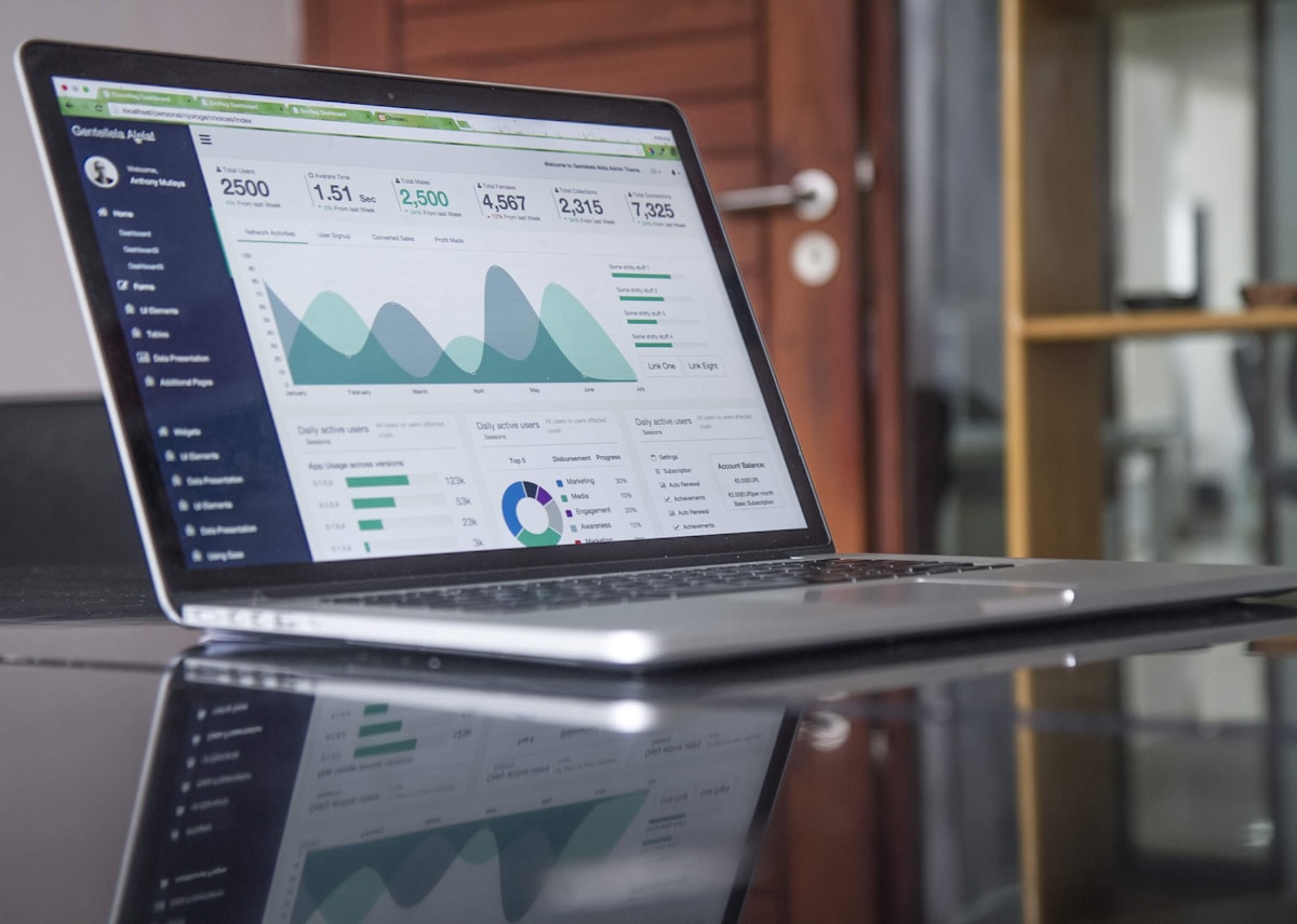
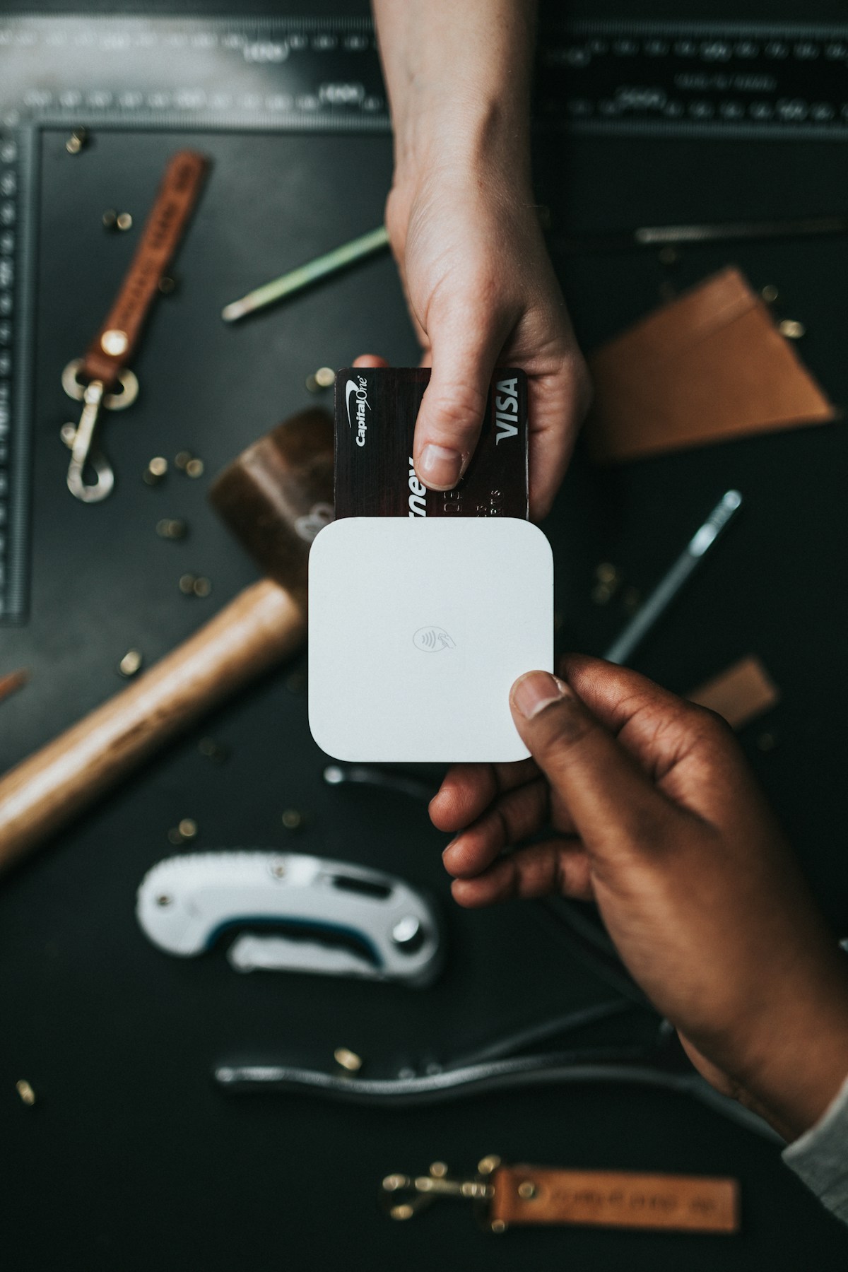
 QR menu platforms provide detailed analytics on customer behavior
Traditional paper menus are blind spots. You have no idea which items customers consider, how long they spend browsing, or what they skip entirely. QR menus solve this with trackable digital interactions.
Modern QR menu platforms track dozens of metrics: scan frequency, page views per session, item view duration, add-to-cart rates, and order completion times. This data reveals what customers want—not just what they order, but what they're considering.
Restaurants using QR menu analytics report 15-30% increases in high-margin item sales by strategically featuring items based on view data. You can identify underperforming menu sections, optimal pricing points, and popular item combinations customers frequently view together.
Key Metrics Every Restaurant Should Track
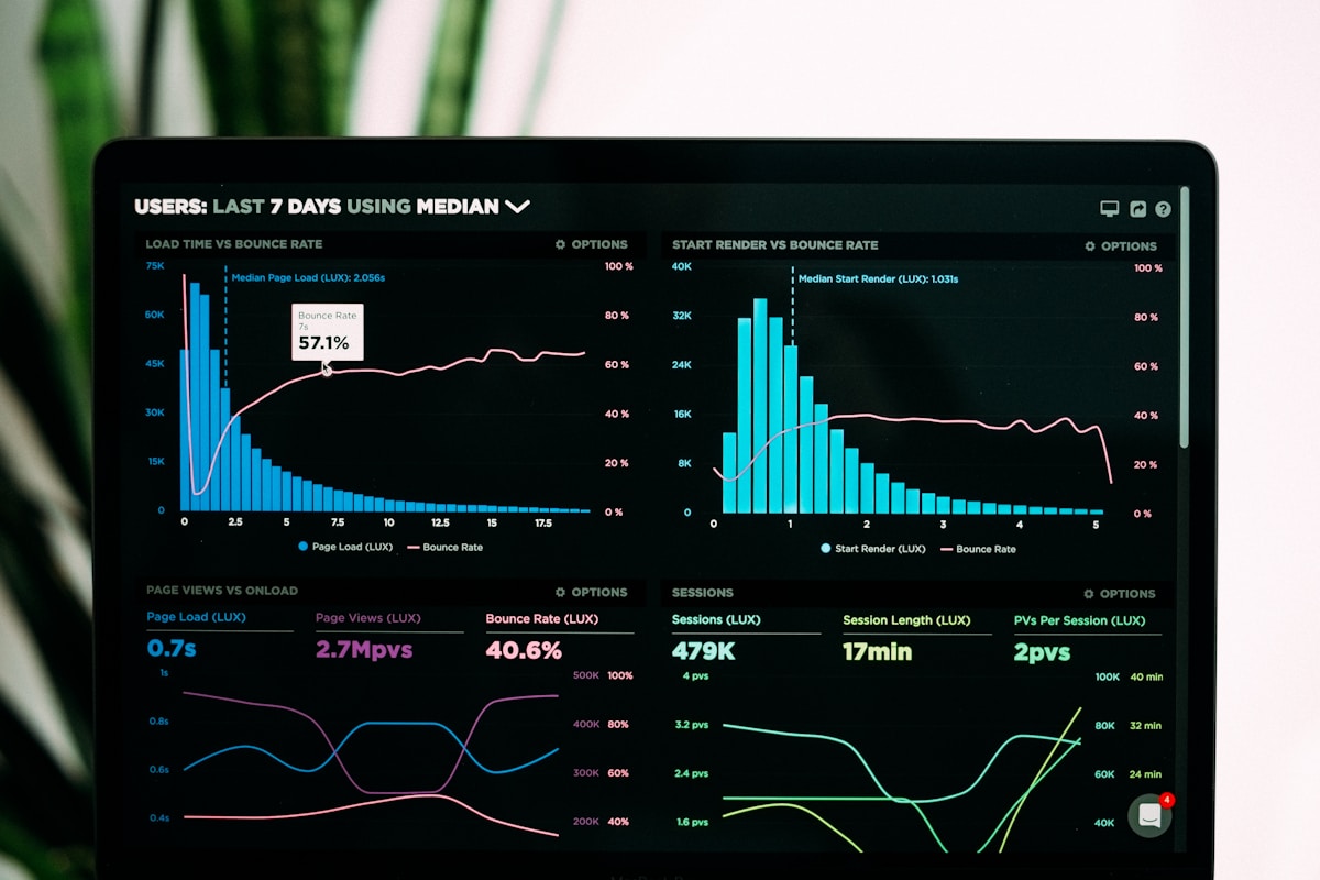
 Essential QR menu analytics metrics from scan to order
QR menu analytics platforms provide various metrics. Focus on these high-impact measurements:
Scan Rate: How many unique QR code scans per day/meal period. Indicates menu accessibility and customer awareness. Low scans might mean poor QR code placement.
Menu View Duration: Average time customers spend browsing. Longer durations suggest interest but potentially confusing navigation. Shorter durations indicate either clear menus or customers leaving before ordering.
Item View Rate: Which menu items get clicked most. High views + low orders suggests pricing issues or poor descriptions. High views + high orders identifies your stars.
Category Performance: Which menu sections (appetizers, entrees, desserts) get most engagement. Helps with menu organization and layout optimization.
Device Types: iOS vs Android, mobile vs tablet. Ensures your menu displays properly on customer devices.
Time-Based Patterns: Engagement differences between lunch, dinner, weekends. Reveals when customers browse most and optimal times for promotions.
Learn how to create an effective QR menu
Tracking Menu Item Performance
 Heatmaps reveal which menu items attract customer attention
Item-level analytics are gold for menu optimization. Track these metrics per dish:
View Count: Total times the item was viewed. High views indicate customer interest—capitalize with better descriptions or photos.
View-to-Order Ratio: Orders divided by views. Low ratios (below 15%) suggest the item looks interesting but something prevents orders—usually price, description, or missing photo.
Average View Duration: Time spent reading item description. Longer durations indicate either high interest or confusing information. Test with clearer descriptions.
Scroll Depth: How far customers scroll before finding your item. Items below the fold get 40% fewer orders. Move high-margin items higher in categories.
MenuTiger's analytics show that items with photos get 120% more orders than text-only listings. Items in the top three positions of each category get 3x more views than items ranked 7-10.
Use this data to reorganize menus monthly. Move high-margin items into prominent positions. Add photos to items with high views but low orders. Remove or relocate items nobody views.
Understanding Customer Journey Data
 Analytics reveal where customers drop off in the ordering process
QR menu analytics show the complete customer journey from scan to payment. Identify friction points causing order abandonment:
Scan → Menu Load: Lost customers here indicate slow loading or broken links. Optimize image sizes and test on slow connections.
Menu Load → Category Browse: Customers leaving immediately suggest poor first impressions. Improve hero images and menu organization.
Category Browse → Item View: Low click-through rates mean unclear category names or uninspiring layout. Test different category orders and icons.
Item View → Add to Cart: High drop-off indicates item descriptions, photos, or prices aren't compelling. A/B test different descriptions.
Cart → Order Submit: Cart abandonment often stems from unexpected fees, limited payment options, or confusing checkout. Simplify and show all costs upfront.
Appetito customers who reduced their checkout from 4 steps to 2 steps saw 35% higher order completion rates. Every extra click costs you sales.
Time-Based Analytics for Menu Optimization
 Time-based analytics reveal peak engagement periods
When customers browse your menu matters as much as what they order. Time-based analytics uncover patterns:
Peak Scanning Times: Most restaurants see scan spikes 11:30 AM-1 PM (lunch) and 6-8 PM (dinner). Schedule menu updates and promotions before these windows.
Day-of-Week Patterns: Friday/Saturday dinners show highest engagement. Wednesday lunches often lowest. Adjust staffing and inventory based on historical scan data.
Session Duration Trends: Lunch browsers spend average 2-3 minutes on menus. Dinner customers spend 4-6 minutes. Optimize lunch menus for speed, dinner menus for exploration.
Seasonal Changes: Summer months show 40% more scans for cold appetizers and salads. Winter increases warm entree views. Adjust featured items seasonally based on past data.
Use historical data to predict demand. If QR analytics show Friday night traffic increased 25% in the past month, increase inventory and staffing proportionally.
Explore QR menu upselling strategies
Geographic and Demographic Insights
 Advanced platforms provide geographic and demographic customer data
Higher-tier QR menu platforms offer demographic insights when customers opt-in or create accounts:
Location Data: Where customers scan from (in-restaurant vs takeout vs delivery). Identifies pickup patterns and delivery zones.
Language Preferences: Which language versions get accessed most. Guides translation priorities for multilingual menus.
Device Quality: Newer phones vs older models indicates customer demographics. Affects decision to use high-res images vs optimized lightweight versions.
Return Customer Rates: How many scans are from repeat vs new customers. High repeat rates indicate loyal base; low rates suggest acquisition focus needed.
Privacy matters—only collect data with customer consent. Clearly state what you track in your privacy policy. Many customers willingly share data in exchange for loyalty points or personalized recommendations.
Appetito's multilingual QR menus automatically track language preferences, helping restaurants identify tourist vs local customer ratios. High tourist traffic justifies adding more language options.
Read about multilingual QR menu solutions
A/B Testing Your QR Menu
 A/B testing different menu layouts reveals what drives more orders
QR menus enable easy A/B testing impossible with printed menus. Test variables to optimize conversions:
Menu Layout: Grid view vs list view. Analytics show grid layouts increase orders by 18% for image-heavy menus.
Item Order: High-margin items first vs traditional category flow. Leading with profitable items increased revenue per table by $4.20 average.
Photo Styles: Professional photography vs smartphone shots. Professional photos increased orders 34% but cost more upfront.
Description Length: Short punchy descriptions vs detailed ingredient lists. Short descriptions (under 20 words) performed better for casual dining.
Price Display: $ symbols vs written prices vs no currency symbol. Tests show $12 outperforms $12.00 and "Twelve Dollars" by 12-15%.
Run A/B tests for minimum two weeks to gather statistically significant data. QR menu platforms like MenuTiger and Beaconstac include built-in A/B testing tools.
One Italian restaurant tested highlighting "Chef's Specials" vs "Most Popular" tags. "Most Popular" increased orders for tagged items by 43%—social proof works.
Integrating QR Analytics with POS Data
 Combining QR menu data with POS sales creates complete customer insights
Maximum value comes from connecting QR menu analytics with POS sales data. This reveals the full picture:
Browse-to-Order Correlation: Which items customers view but order in person instead of digitally. Indicates items needing better digital presentation.
Upsell Effectiveness: Track when servers successfully upsell items customers viewed but didn't add to cart. Identifies training opportunities.
Kitchen Prep Patterns: Correlate item views with actual prep time. If lobster gets viewed 100 times but only ordered 20 times, kitchen doesn't need 100 portions ready.
Revenue Attribution: Calculate revenue from QR ordering vs traditional ordering. Justifies investment in digital menu improvements.
Square and Toast POS systems offer direct QR menu integrations. Menu updates sync automatically, and analytics combine into unified dashboards.
Restaurants using integrated analytics reduce food waste by 22% on average—preparing inventory based on item views rather than historical sales alone.
Learn about best POS systems for restaurants
Privacy and Data Ethics
 Transparent data collection builds customer trust
Collecting customer data requires responsibility. Follow these privacy best practices:
Be Transparent: Clearly state what data you collect and why. Add privacy policy link to QR menu footer.
Minimize Collection: Only track metrics you'll actually use. Excessive data collection risks violations and customer distrust.
Secure Storage: Use platforms with encryption and SOC 2 compliance. Customer data breaches destroy reputations.
Respect Opt-Outs: Provide easy ways for customers to decline tracking. Cookie consent banners for web-based QR menus.
Delete Old Data: Establish retention policies. Data older than 2 years likely isn't actionable and increases liability.
Compliance: Follow GDPR (Europe), CCPA (California), and local data laws. Fines for violations start at $7,500 per incident.
Customers accept tracking when they receive value in return. Loyalty programs, personalized recommendations, and faster ordering justify data collection. Never sell customer data to third parties—that destroys trust permanently.
Actionable Steps to Implement QR Menu Analytics
 Step-by-step process to start tracking QR menu performance
Ready to leverage QR menu analytics? Follow this implementation process:
Step 1: Choose an analytics-enabled QR menu platform. MenuTiger, Appetito, and Beaconstac offer comprehensive analytics. Avoid basic QR generators lacking tracking.
Step 2: Set up goal tracking. Define what success looks like: orders per scan, average order value, menu view duration, etc.
Step 3: Establish baseline metrics. Run 2-4 weeks without changes to understand current performance.
Step 4: Identify problem areas. High bounce rates, low view-to-order ratios, abandoned carts—prioritize fixes based on revenue impact.
Step 5: Implement changes incrementally. Test one variable at a time to isolate what works. Changing everything simultaneously makes analysis impossible.
Step 6: Monitor weekly. Check analytics every Monday to review previous week's patterns. Identify trends early.
Step 7: Monthly optimization. Make menu adjustments based on accumulated data. Move items, update photos, adjust pricing.
Step 8: Quarterly deep dives. Analyze seasonal patterns, calculate ROI of changes, plan next quarter's optimizations.
Most restaurants see measurable improvements within 30 days of tracking analytics. Initial wins often come from simply adding photos to high-view, low-order items.
Conclusion
 Data-driven menu optimization gives restaurants competitive advantage
QR menu analytics transform blind guesswork into data-driven decisions. By tracking customer behavior from scan to order, you uncover opportunities invisible with traditional menus.
Start with the basics: scan rates, view durations, and item performance. Identify quick wins like repositioning high-margin items or adding photos to popular categories. Graduate to advanced analytics like A/B testing and POS integration once you've optimized the fundamentals.
The restaurants winning in 2026 are those treating menus as dynamic, data-informed sales tools rather than static price lists. QR menu analytics provide the insights needed to continuously improve, test, and refine your offering based on actual customer behavior.
Your menu is your primary sales tool. Make sure you're measuring its performance.
More Articles
AI-Powered Restaurant Inventory Forecasting: Reduce Waste and Boost Profits
Discover how AI inventory forecasting predicts demand, optimizes orders, and reduces food waste. Machine learning tools for smarter restaurant inventory management.
Appetito Menu Review: Multilingual QR Menus for Restaurants
Complete Appetito Menu review covering multilingual QR menu features, pricing, setup process, and how it compares to Fuudey, Menu Tiger, and alternatives.
Best Free QR Code Menu Generator in 2025 (7+ Reviewed)

We tested 8 free QR code menu generators including Fuudey, QR Menu Creator, Menuu, ScanIt.menu, and more. Full comparison with pricing, features, and honest reviews.